博文中所有出现的.someName都CSS中的语法
#1. BootStrap基本用法
1 2 3 4 5 6 7
| <!DOCTYPE HTML> <html> <head> <meta http-equiv="Content-Type" content="text/html; charset=utf-8"> <title>Andrew_liu的秘密空间</title> <link rel="stylesheet" type = "text/css" href="css/bootstrap.css"> </head>
|
1 2 3 4 5 6 7
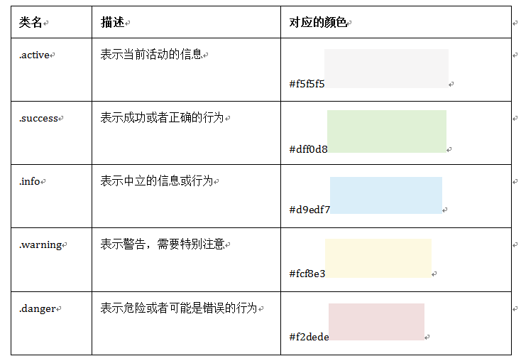
| <p class = "lead">我还真是不知道写什么号,做个对比好了, 其实是字体变大了</p> .text-muted:提示,使用浅灰色(#999) .text-primary:主要,使用蓝色(#428bca) .text-success:成功,使用浅绿色(#3c763d) .text-info:通知信息,使用浅蓝色(#31708f) .text-warning:警告,使用黄色(#8a6d3b) .text-danger:危险,使用褐色(##a94442)
|
##1.1. 对齐方式
Bootstrap通过定义四个类名来控制文本的对齐风格:
☑ .text-left:左对齐(class = "text-left)
☑ .text-center:居中对齐
☑ .text-right:右对齐
☑ .text-justify:两端对齐
##1.2. 列表
- Bootstrap中通过给无序列表添加一个类名
.list-unstyled提供一个去掉列表
- 通过添加类名
.list-inline来实现内联列表,简单点说就是把垂直列表换成水平列表,而且去掉项目符号(编号),保持水平显示。也可以说内联列表就是为制作水平导航而生。
- 定义列表, 没有太大变化
- 水平定义列表就像内联列表一样,Bootstrap可以给
添加类名.dl-horizontal给定义列表实现水平显示效果
1 2 3 4 5 6
| <dl> <dt>W3cplus</dt> <dd>一个致力于推广国内前端行业的技术博客</dd> <dt>慕课网</dt> <dd>一个真心在做教育的网站</dd> </dl>
|
##1.3. BootStrap代码风格
在Bootstrap主要提供了三种代码风格:
- 使用
<code></code>来显示单行内联代码,一般是针对于单个单词或单个句子的代码
- 使用
<pre></pre>来显示多行块代码,一般是针对于多行代码(也就是成块的代码),pre标签上添加类名.pre-scrollable,就可以控制代码块区域最大高度为340px,一旦超出这个高度,就会在Y轴出现滚动条。
- 使用
<kbd></kbd>来显示用户输入代码,一般是表示用户要通过键盘输入的内容
##1.4. 表格
- Bootstrap为表格不同的样式风格提供了不同的类名,主要包括:
☑ .table:基础表格
☑ .table-striped:斑马线表格
☑ .table-bordered:带边框的表格,基础表格<table class="table">基础上添加一个“.table-bordered”, <table class = "table table-bordered">
☑ .table-hover:鼠标悬停高亮的表格
☑ .table-condensed:紧凑型表格
☑ .table-responsive:响应式表格
可以多个类结合使用
1 2 3 4 5 6 7 8 9 10 11 12 13 14 15 16 17 18 19 20 21 22 23 24 25 26 27 28 29 30 31 32
| <h1>斑马线表格</h1> <table class="table table-striped"> <thead> <tr> <th>表格标题</th> <th>表格标题</th> <th>表格标题</th> </tr> </thead> <tbody> <tr> <td>表格单元格</td> <td>表格单元格</td> <td>表格单元格</td> </tr> <tr> <td>表格单元格</td> <td>表格单元格</td> <td>表格单元格</td> </tr> <tr> <td>表格单元格</td> <td>表格单元格</td> <td>表格单元格</td> </tr> <tr> <td>表格单元格</td> <td>表格单元格</td> <td>表格单元格</td> </tr> </tbody> </table>
|
- Bootstrap还为表格的行元素
提供了五种不同的类名,每种类名控制了行的不同背景颜色
#2. 表单控件
表单中常见的元素主要包括:文本输入框、下拉选择框、单选按钮、复选按钮、文本域和按钮等
- 在
<form>元素上使用类名form-horizontal主要有以下几个作用:
- 设置表单控件padding和margin值。
- 改变“form-group”的表现形式,类似于网格系统的“row”。
- 表单的控件都在一行内显示,只需要在
<form>元素中添加类名form-inline
##2.1. 添加表单
1 2 3 4 5
| <form role="form"> <div class="form-group"> <input type="email" class="form-control" placeholder="Enter email"> //Bootstrap框架都是通过input[type=“?”]的形式来定义样式的。 </div> </form>
|
##2.2. 下拉选择框select
多行选择在<select>中设置multiple属性的值为multiple。
1 2 3 4 5 6 7 8 9 10 11 12 13 14 15 16 17 18 19 20
| <form role="form"> <div class="form-group"> <select class="form-control"> //普通选择框 <option>1</option> <option>2</option> <option>3</option> <option>4</option> <option>5</option> </select> </div> <div class="form-group"> <select multiple class="form-control"> //多项下拉选择框 <option>1</option> <option>2</option> <option>3</option> <option>4</option> <option>5</option> </select> </div> </form>
|
##2.3. 文本域textarea
设置rows可定义其高度,设置cols可以设置其宽度。但如果textarea元素中添加了类名“form-control”类名,则无需设置cols属性。因为Bootstrap框架中的“form-control”样式的表单控件宽度为100%或auto。
1 2 3 4 5
| <form role="form"> <div class="form-group"> <textarea class="form-control" rows="3"></textarea> </div> </form>
|
##2.4. 复选框checkbox(多选)和单选择按钮radio%%
- 不管是checkbox还是radio都使用label包起来了
- checkbox连同label标签放置在一个名为
.checkbox的容器内
- radio连同label标签放置在一个名为
.radio的容器内
在Bootstrap框架中,主要借助“.checkbox”和“.radio”样式,来处理复选框、单选按钮与标签的对齐方式
1 2 3 4 5 6 7 8 9 10 11 12 13 14 15 16 17 18 19 20
| <form role="form"> <div class="checkbox"> <label> <input type="checkbox" value=""> 记住密码 </label> </div> <div class="radio"> <label> <input type="radio" name="optionsRadios" id="optionsRadios1" value="love" checked> 喜欢 </label> </div> <div class="radio"> <label> <input type="radio" name="optionsRadios" id="optionsRadios2" value="hate"> 不喜欢 </label> </div> </form>
|
- 如果checkbox需要水平排列,只需要在label标签上添加类名
checkbox-inline
- 如果radio需要水平排列,只需要在label标签上添加类名
radio-inline
1 2 3 4 5 6 7 8 9 10 11 12 13 14 15 16 17 18 19 20 21 22 23 24
| <form role="form"> <div class="form-group"> <label class="checkbox-inline"> <input type="checkbox" value="option1">游戏 </label> <label class="checkbox-inline"> <input type="checkbox" value="option2">摄影 </label> <label class="checkbox-inline"> <input type="checkbox" value="option3">旅游 </label> </div> <div class="form-group"> <label class="radio-inline"> <input type="radio" value="option1" name="sex">男性 </label> <label class="radio-inline"> <input type="radio" value="option2" name="sex">女性 </label> <label class="radio-inline"> <input type="radio" value="option3" name="sex">中性 </label> </div> </form>
|
##2.5. 按钮(核心)
在Bootstrap框架中的按钮都是采用<button>来实现。
- input[type=“submit”]
- input[type=“button”]
- input[type=“reset”]
<button>
Bootstrap框架V3.x版本的基本按钮和V2.x版本的基本按钮一样,都是通过类名btn来实现, 钮除了使用<button>标签元素之外,还可以使用<input type="submit">和<a>标签,唯一需要注意的是,要在制作按钮的标签元素上添加类名btn

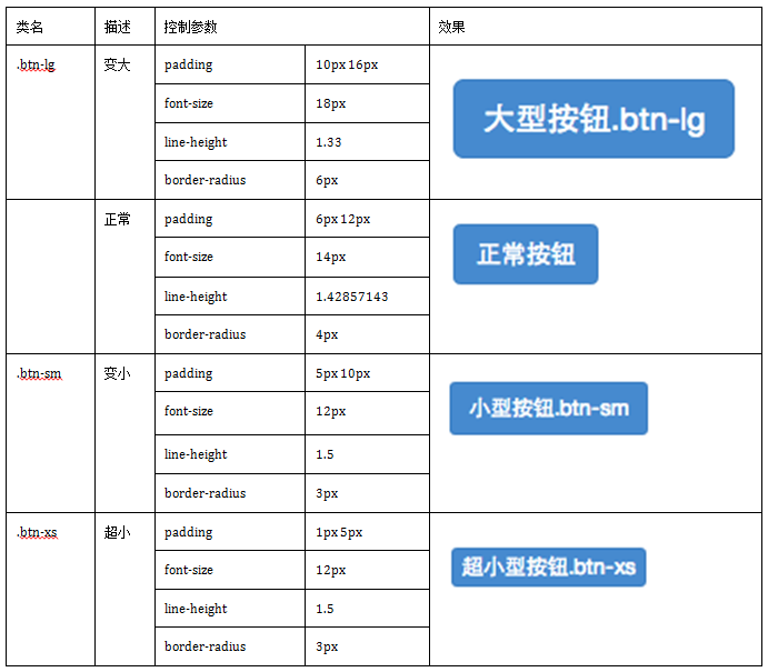
###2.5.1. 按钮大小
- 在Bootstrap框架中控制按钮的大小都是通过修改按钮的
padding、line-height、font-size和border-radius几个属性。
- 块状按钮 : Bootstrap框架中提供了一个类名
btn-block。按钮使用这个类名就可以让按钮充满整个容器,并且这个按钮不会有任何的padding和margin值。
###2.5.2. 按钮状态
- Bootstrap按钮的活动状态主要包括按钮的悬浮状态(:hover),点击状态(:active)和焦点状态(:focus)几种。
- 在Bootstrap框架中,要禁用按钮有两种实现方式:
- 在标签中添加disabled属性
- 在元素标签中添加类名“disabled”
对于<button>元素是通过:active伪类实现,而对于这样的标签元素则是通过添加类名.active来实现。
##2.6. 表单控件大小
可以通过设置控件的height,line-height,padding和font-size等属性来实现控件的高度设置。
不过Bootstrap框架还提供了两个不同的类名,用来控制表单控件的高度。
- input-sm:让控件比正常大小更小
- input-lg:让控件比正常大小更大
- Bootstrap框架的网格系统提供
col-xs-4要控制表单宽度
1 2 3 4 5 6 7 8 9 10
| <form role="form"> <div class="form-group col-xs-6"> //col-xs-6是控制宽度的类,数字用以控制宽度 <label class="control-label">控件变大</label> <input class="form-control input-lg" type="text" placeholder="添加.input-lg,控件变大">// input-lg控制高度 </div> <div class="form-group"> <label class="control-label">控件变小</label> <input class="form-control input-sm" type="text" placeholder="添加.input-sm,控件变小"> </div> </form>
|
##2.7. 表单控件状态
###2.7.1. 禁用状态
在相应的表单控件上添加属disabled
<input class="form-control" type="text" placeholder="表单已禁用,不能输入" disabled>
在Bootstrap框架中,如果fieldset设置了disabled属性,整个域都将处于被禁用状态。
1 2 3 4 5 6 7 8 9 10 11 12 13 14 15 16 17 18 19 20
| <form role="form"> <fieldset disabled> <div class="form-group"> <label for="disabledTextInput">禁用的输入框</label> <input type="text" id="disabledTextInput" class="form-control" placeholder="禁止输入"> </div> <div class="form-group"> <label for="disabledSelect">禁用的下拉框</label> <select id="disabledSelect" class="form-control"> <option>不可选择</option> </select> </div> <div class="checkbox"> <label> <input type="checkbox">无法选择 </label> </div> <button type="submit" class="btnbtn-primary">提交</button> </fieldset> </form>
|
###2.7.2. 验证状态
- .has-warning:警告状态(黄色)
- .has-error:错误状态(红色)
- .has-success:成功状态(绿色)
不同的状态会提供不同的icon,比如成功是一个对号(√),错误是一个叉号(×),Bootstrap框中也提供了这样的效果。在对应的状态下添加类名has-feedback。请注意,此类名要与has-error、has-warning和has-success在一起.
1 2 3 4 5 6 7 8 9 10 11 12 13 14 15 16 17
| <form role="form"> <div class="form-group has-success has-feedback"> <label class="control-label" for="inputSuccess1">成功状态</label> <input type="text" class="form-control" id="inputSuccess1" placeholder="成功状态" > <span class="glyphiconglyphicon-ok form-control-feedback"></span> </div> <div class="form-group has-warning has-feedback"> <label class="control-label" for="inputWarning1">警告状态</label> <input type="text" class="form-control" id="inputWarning1" placeholder="警告状态"> <span class="glyphiconglyphicon-warning-sign form-control-feedback"></span> </div> <div class="form-group has-error has-feedback"> <label class="control-label" for="inputError1">错误状态</label> <input type="text" class="form-control" id="inputError1" placeholder="错误状态"> <span class="glyphiconglyphicon-remove form-control-feedback"></span> </div> </form>
|
###2.7.3. 表单提示信息
help-block样式,将提示信息以块状显示,并且显示在控件底部
1 2 3 4 5 6 7 8 9
| <form role="form"> <div class="form-group has-success has-feedback"> <label class="control-label" for="inputSuccess1">成功状态</label> <input type="text" class="form-control" id="inputSuccess1" placeholder="成功状态" > <span class="help-block">你输入的信息是正确的</span> <span class="glyphiconglyphicon-ok form-control-feedback"></span> </div> … </form>
|
##2.8. 图像
- img-responsive:响应式图片,主要针对于响应式设计
- img-rounded:圆角图片
- img-circle:圆形图片
- img-thumbnail:缩略图片
1 2 3
| <img alt="140x140" src="http://placehold.it/140x140"> <img class="img-rounded" alt="140x140" src="http://placehold.it/140x140"> <img class="img-circle" alt="140x140" src="http://placehold.it/140x140">
|
##2.9. 图标
- 在任何内联元素上应用所对应的样式
- 所有icon都是以
glyphicon-前缀的类名开始,然后后缀表示图标的名称
图标
1 2 3 4 5 6 7
| <body> <span class="glyphicon glyphicon-search"></span> <span class="glyphicon glyphicon-asterisk"></span> <span class="glyphicon glyphicon-plus"></span> <span class="glyphicon glyphicon-cloud"></span> </body> </html>
|